Interactive prototypes,
Implementation strategy,
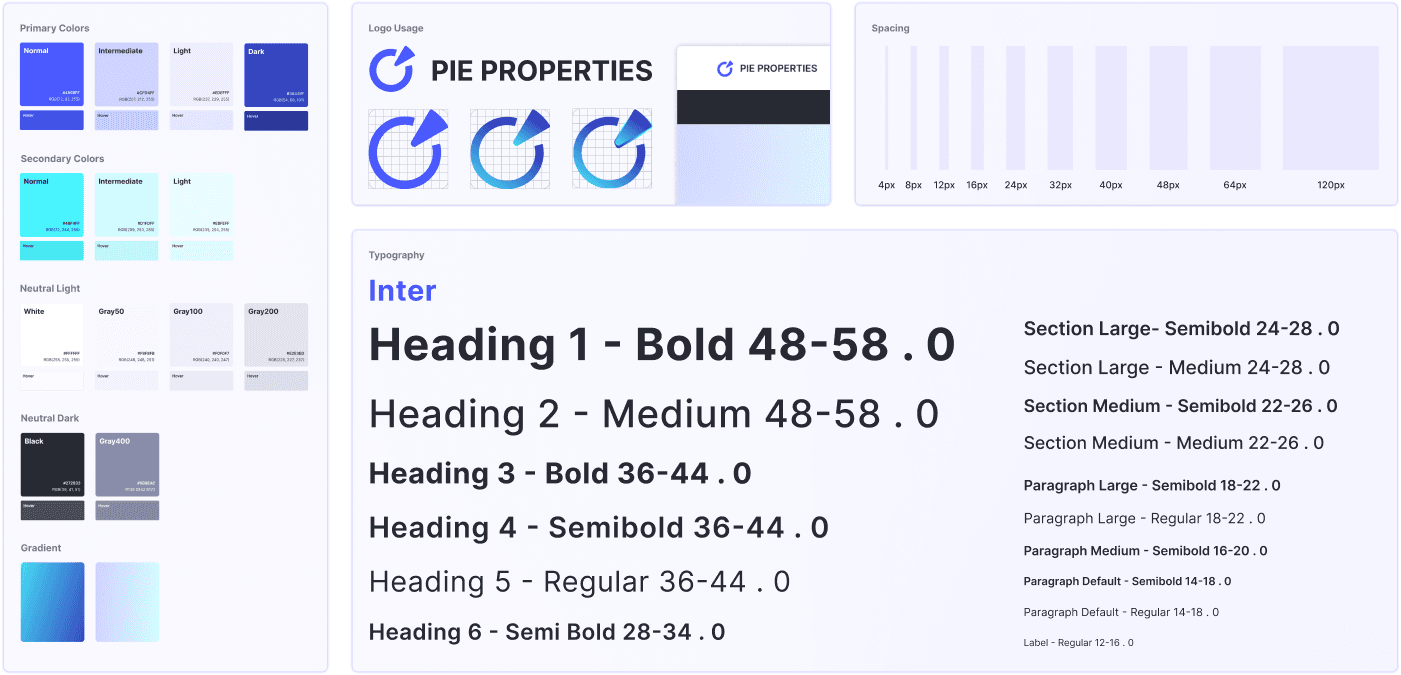
Branding elements
2 months
(06/2023-08/2023)
INTRO
Project Summary
Alphax is a single family residential investment group & developer in Bay area. In this project, our team partnered with Alphax to design a website that transitions their business to a digital platform, facilitating their transformation from a traditional real estate investment firm into a Fintech company. Our designs focused on enhancing user engagement and increasing conversion rates to support Alphax’s business expansion.
Goals
Helped the company transition their business to digital platform
Increased user engagement and conversion rate
user engagement
Conversion rate
My Contributions
Played a key role in designing the browsing experience and fund detail page.
Conducted stakeholder interviews to identify key challenges and gather business requirements.
Contributed to the style guide by defining the tab component.
What you can expect
My most challenging project!
I will share two stories to illustrate how I drove design direction and solved key challenges.
What i present here is just the highlights of the story. If you are interested in the whole story, let’s talk!
Now let's start the journey! 🪄
CHALLENGE 1
From chaos to clarity
Initially: NO IDEA. NO SCOPE.
We needed to find out:
-What’s our goal?
-What’s current problem?
-What’s our design direction?
UNDERSTAND
Stakeholder Interview
I proactively conducted stakeholder interviews and discovered that the current issue is their reliance on traditional methods, such as phone calls and emails, at every stage of the business process—from reaching out to users to signing contracts.
Problem
Current Business Process -❌Inefficient
User Journey Map
From user interviews, we also mapped each phase of the user flow and analyzed users' emotions at each stage to identify pain points and opportunities.
GOAL
HMW
After identifying the current problem from both the client’s and user’s perspectives, we developed the following HMW statement.
💻
How might we keep all user task phases within a single touchpoint
ℹ
How might we help users better understand fund details?
🗺
How might we support users in making informed decisions?
EXPLORE
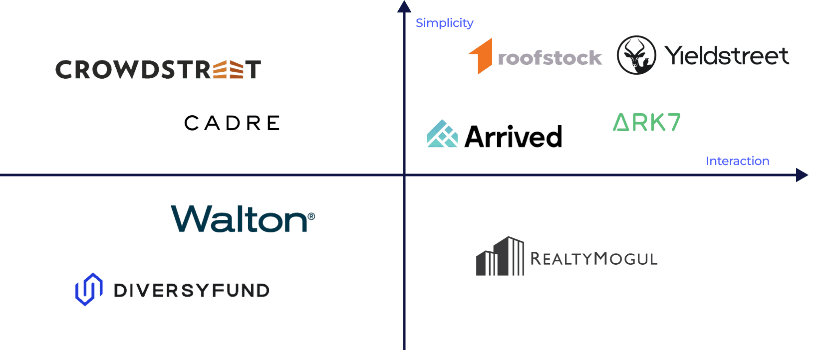
Competitor Analysis
We analyzed 10 competitor products, including Ark7, DiversyFund, Yieldstreet, PeerStreet, and CrowdStreet, to identify gaps and uncover design opportunities.
Design Opportunities
Map View
Design a map view to see the amenities around the property
Return Calculator
The return calculator to help investor calculate their estimate return
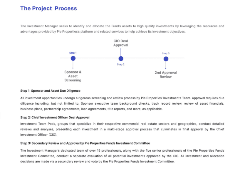
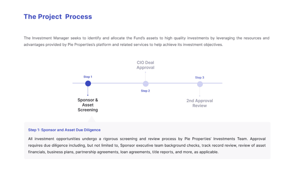
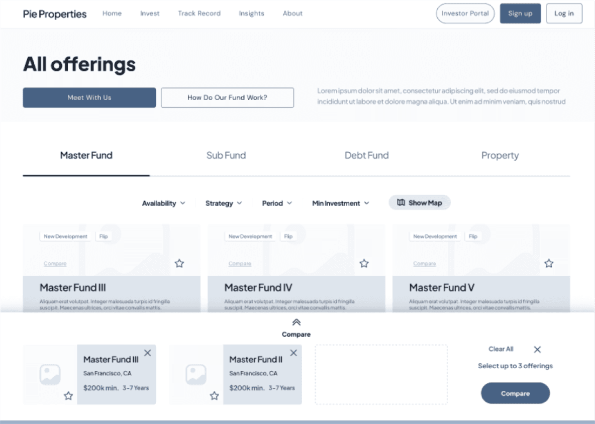
Comparison Feature
Help me investors to compare different fund
Now we started crafting ✏️
DESIGN
Design Iteration
Comparison Feature
Set aside due to high development cost⛔️
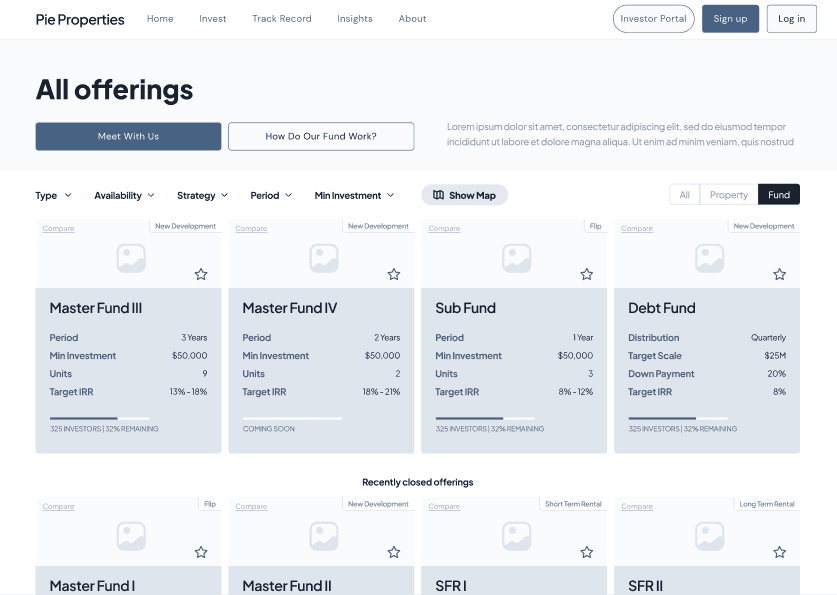
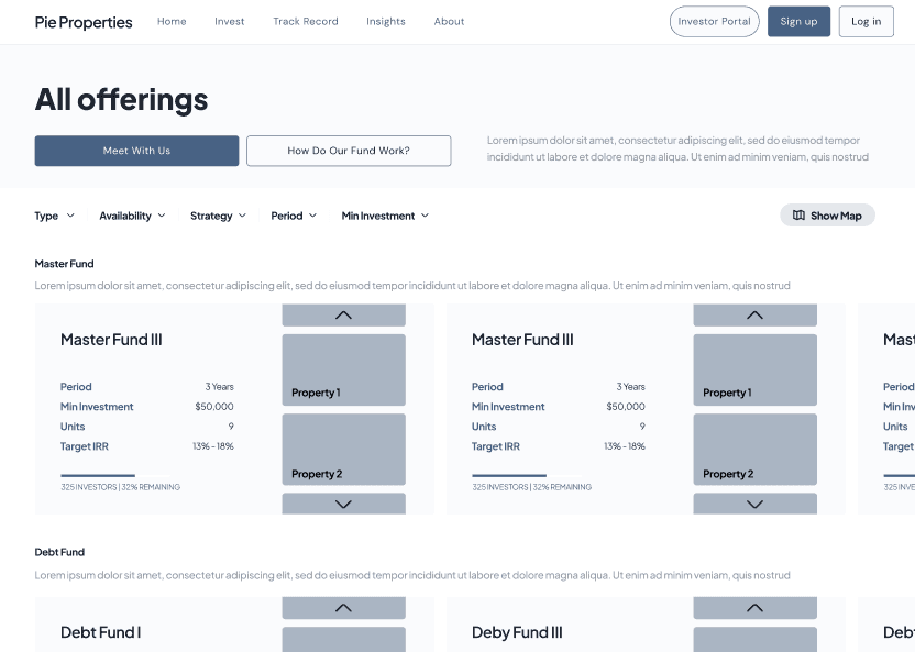
Browse Offering Page
Option 1
❌can only see limited information of properties
✅Can present more funds at the same time
Option 2
Picked
✅Shows the hierarchy of fund and properties
✅Able to browse different properties in the funds
✅Investment progress bar to show the progress of fundraising
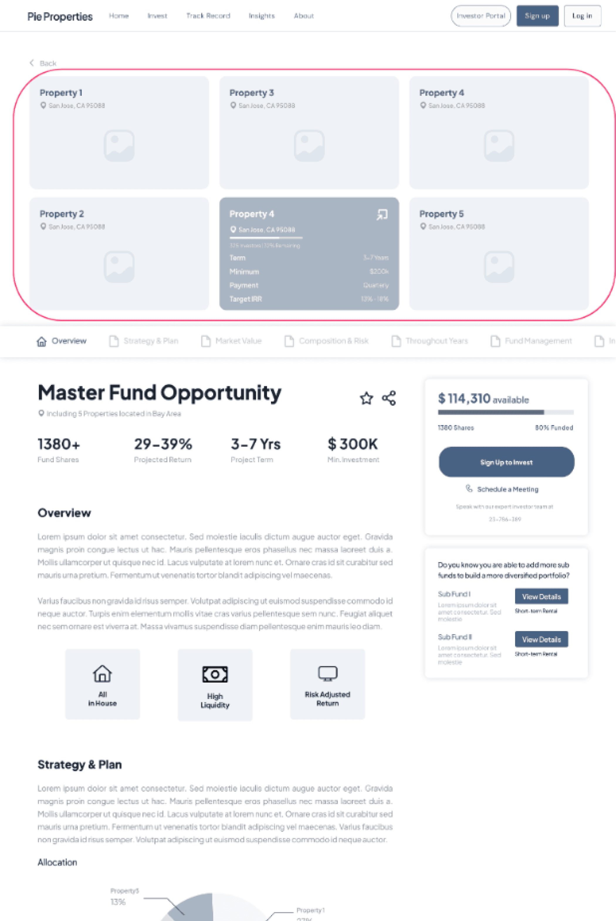
Fund Detail Page
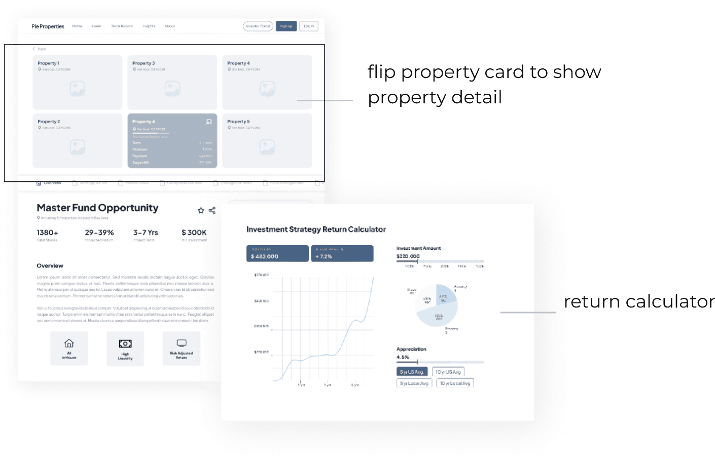
Option 1
✅Flipping card to see the detail of different properties
✅Trigger to sign up and book consultation before investing
❌Incorrect hierarchy of property and fund
❌Too much text
Option 2
✅Interactive map to see the amenity around the properties
✅Return prediction tool
Need to improve user engagement
While eah option has its upside and downside, clients pointed out that current detail page design is overloaded, which might cause users feel overwhelmed and they are worried that too much text and chart will discourage users’ engagement.
Simplicity and user interaction are the keys
Through researching on other competitors, we found that simplicity and user interaction are two important factors that increase user engagement on the pages.
Then we made following changes
Keep the information simple and clear, remove redundant parts
Increase user interaction on the page (details below)
Design Iteration
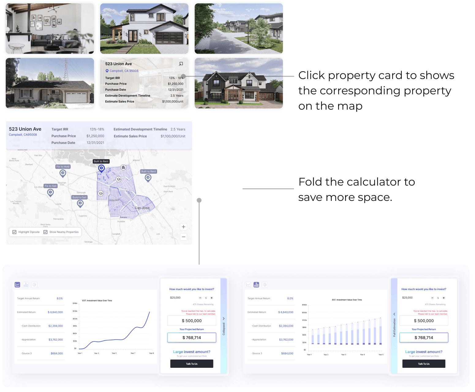
Calculator & Map
Before
After
Fixed the hierarchy problem by replacing property cards
Interconnected property cards and property map
Fold calculator to better utilize the space
Users can expand the calculator to see more details
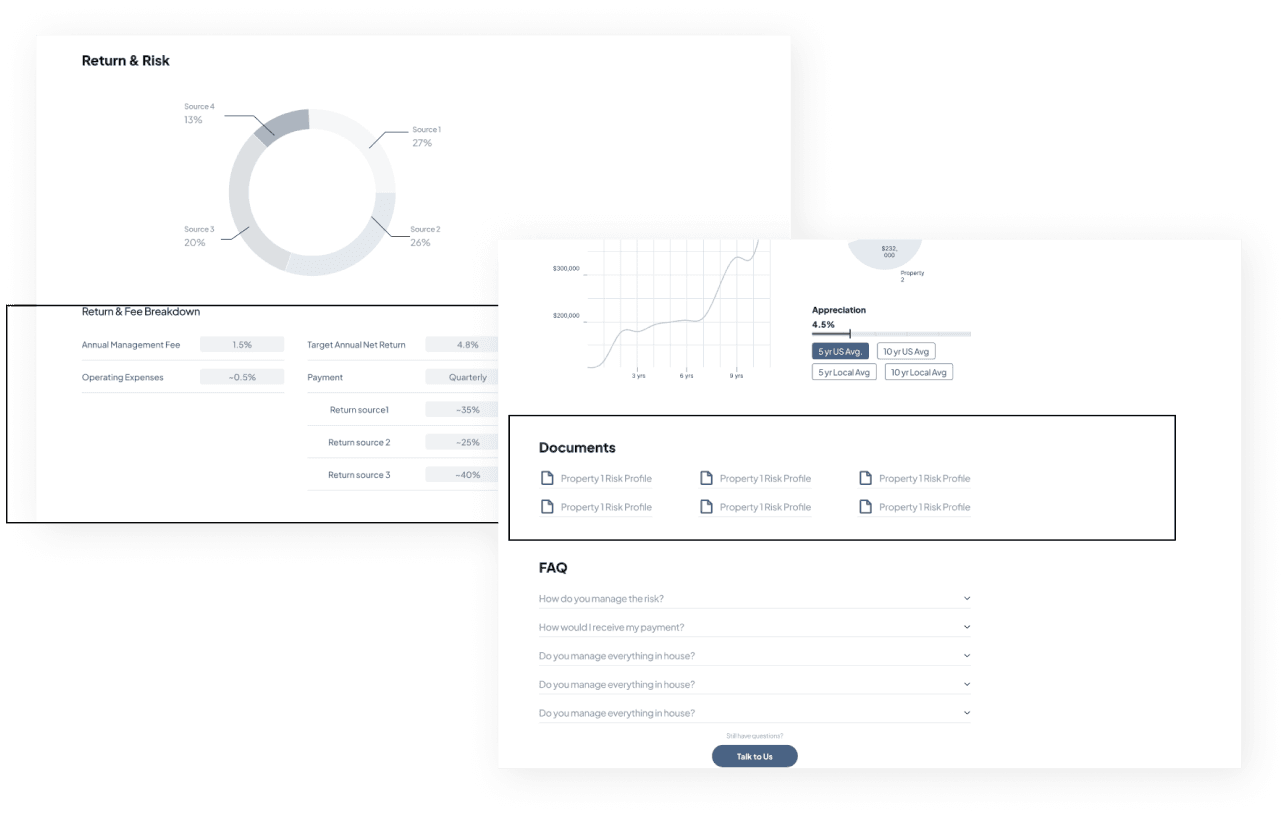
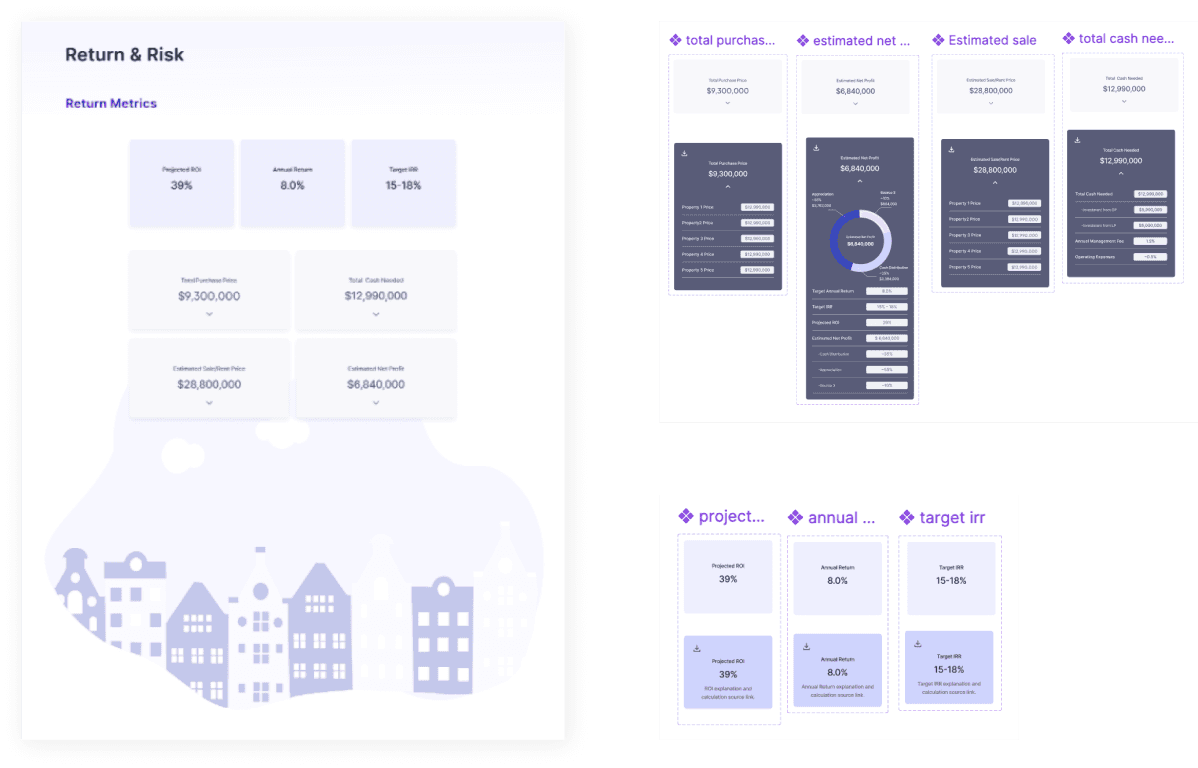
Fund Detail - Return & Risk
Before
After
Fund Detail - Project Timeline
Before
After
Stakeholder’s Feedback
After presenting our finished design to client, we received positive feedback and started collaborating with engineer to make sure implementation.
“Now the page is clear and appealing. Wonderful, let’s do it!” 🎉
Now check our final solution! ⬇


